Tuesday, December 14, 2010

Interactions Between the 3 levels


Representational......
The brick wall of representation functions as a background in the poster and tells us the we are in 
an urban environment.  The paint of the abstract images mimics graffiti with paint dripping 
down the wall implying rebellion, and the light splashing across the image tells us 
that it is night and that the movie will be dark.  Essentially we are given a 
setting for the story of the movie.

...Abstract...
In the abstract level the we see the image of  a red bat with two black circles above it which transform the whole into a face similar to the Joker.  This causes the bat, which symbolizes batman to bounce back and forth between the symbolic level of batman and the abstract level of Jokers mouth.  The abstract level pops the most with the red bat and high contrast of the black eyes in the center of the poster.

......Symbolic
The symbolic level holds all the pertinent information;  what - The Dark Knight; when - 2008; 
who - Warner Brothers, Legendary Pictures, DC Comics; and where (to get more info) - www.thedarkknight.com.  It also hints to the content of the film as in the main villain,
 the Joker, with the "WHY SO SERIOUS?" phrase at the top and the hero with the 
symbol of the bat.  It is the last level we see in the design of the movie poster.

Tuesday, December 7, 2010

Week 14 - Representational, Abstract and Symbolic

Representational


This is a representational drawing of a biplane.  It is a detailed drawing depicting the biplane as a three dimensional object in space.  It is drawn in proportionately and accurately.  The image feels flat as if it were traced from a photograph. Even though the lines of the wings dynamically cut diagonally across the page the lack of a back ground, the lack of lines indicating movement and the static propeller hold the image to the representational form.


Abstract


This abstraction of a plane shows us the essential parts of a plane, the cockpit, the tail, and the wing, though it looks nothing like a real plane there is enough information to decipher its purpose.  There are stick-people with in the plane smiling happily as it flys along in the puffy white clouds of the sky.  A story is imagined out of the image.  The colors are bright and vibrant happy colors.  The image is drawn in the style of a child calling up the emotions of being a kid and playing with colors and drawing for fun.


Symbolic

The Expedia logo has a purely symbolic image of a plane in a shaded blue orb.  The icon lays diagonally across the orb implying movement as if showing the plane flys around the world.  As negative space the graphic symbol bounces back and for between the foreground and background which I think adds to the idea of movement in the symbol.  Expedia plays on the word expedite - to make and action to be accomplished more quickly - again compounding the idea of fast travel and movement.

Tuesday, November 16, 2010

Visual Techniques - Week 12

created by

transparency, asymmetry, intricacy, singularity


Developed by 
Juxtaposition, balance, repetition, transparency

Both designs make use of transparency.  In the band poster the designers are making use of a byproduct of silkscreening. While in the interface design it is done out of a necessity for a user to be able to see the game world.  The juxtaposition of party icons and the minimap pop out more than the other elements due to their opacity.  The Interface also uses economy in an effort to keep the screen and game world clear.  In contrast the poster uses Singularity with the elephant head to draw in the viewer.  Then the use of intricacy to hold the viewers attention on the poster.  Repetition on the lower bar of the interface separates the circle buttons on the left from the square action buttons in the middle and the circle bag buttons on the right.  The circle square circle also gives a base of balance to the interface with the minimap and quest log on the right and the party icons and chat log on the left.

Tuesday, November 2, 2010

Implied Motion in Design


In this Bill Paterson's poster art for the Rolex Monterey Motorsports Reunion.  The poster is for racing and needed to portray speed and movement. Motion is implied initially with the diagonal orientation of the car across the page. The long brushstrokes that make up the ground are set in the same direction building upon the dynamics of the diagonal.  Other brushstrokes pull off of the back of the car and the tires implying the blur of a speed faster than the human eye.  The blurry shape of the building in the background also implies this motion and speed.  the front of the car is crisp and clear and blurs ever so slightly as you follow its shape to the back of the car.  I find the image is very striking and successful portrayal of the speed and motions of racing.

This is a photograph of a rugby match by Ross Land.  Motion in this image is shown through the unbalanced state of one player tackling another.  The green player is in mid air grasping the blue player.  We expect him to come crashing into the ground at any moment because of his unnatural position. The blue players center of balance is leaning to the left of the frame.  Only his toe is touching the ground.  His in the fore ground may show blur from movement or could be out of focus.  It is not clear.  The green player in the back show less motion with his left foot firmly planted in the ground as he chases the other two.  I find this image some what less successful the race car.  Perhaps if there were more diagonals cutting across the page...

Tuesday, October 26, 2010

Dimension/Depth/Space


For this weeks Blog Exercise I chose a page from one of the web-comics I read, Gutters Issue 45.  The background of the website makes use of lots of overlap with pens, pencils, brushes and erasers on the edges of the comic page. Tone and line also help to give these artists tools a perceived 3-dimensional quality. Navigation is located at the bottom of the page and sort of makes use of overlap. My favorite is an inkblot behind the papers and ruler near the top. I also like that the add banner is set within the ruler. Inside the page the artist uses linear perspective and simulates atmospheric perspective in panels 1 and 6.  He also uses overlap with a characters foot in panel 1, one character over another in panel 3, and the noise words of panel 4.  Panel 5 makes use of relative size and overlap to show characters at a distance behind a dying civilian in the foreground.   Relative size and height simulates the distance between the characters of frame 6 combined with some overlap and linear perspective to make it the most complicated and interesting panel.

Tuesday, October 5, 2010

Week 6: Syntactical Guidelines - Success and Failure Pancakes

- Failure Pancakes -

The first panel is nearly indistinguishable from the second panel.  The main subject, G, of the panel crosses from panel 1 into panel 3, but is still behind V, the main subject of panel 2, which causes confusion with the reader.  It appears as though G and V are fighting back to back, but they're not, for in the far right corner of panel 2 you see that G is shooting at V.  The backgrunds of panels 1 and 2 are also a similar pinkish tone causing them to blend.  In Panel 3 all the motion travels against the flow of reading (left-right, top-down) and in panel 4 the motion moves in an arc back towards panel 2, not down to panel 5.  Panel 5 sits in the fore ground as an out line of V, which is also slightly confusing because overlaps panel 3. Panel 6, the last, is the muted pinkish again making it difficult to distinguish but the white of the "Thwup" draws attention leading down to G shooting from the corner of the page implying the turning of the page.  In general the page fails because the artist tried to use to many tricks of characters coming in and out of the panels and foreground,  the motion countering the way we read.  The panels are unclear, not balanced and cluttered with no symmetry guide the reader.   I can imagine what the artist was trying to create, a sort of chaos of battle, but there is so much chaos the reader is unable to tell whats going on.

-Success!!! -
This page is much clearer.  The fist panel is an establishing shot of a palace with a river that flows with the way we read.  The middle frame follows the fire flowing from someones arm in the fore ground across the panel, again following the flow of reading.  In the 3rd panel the fire circles around the main subject ending at a word bubble that points to another word bubble in panel 4.  In panel 4 the reader continues to follow the fire around the frame to bottom right corner and last word bubble.  At which point the reader may decide to turn the page or follow the fire around the frame and backwards though the comic.  The panels are arranged symmetrically keeping the page clear/clean. Within each panel is a balance, such as in the first with the palace on the left and narration on the right.


Tuesday, September 28, 2010

Week 5: Visual vs. Symbolic Language

Separation, confinement, jail, blue-collar, working class, disgust, despair, determination, drive, disbelief, impatience, waiting, hot day, long day, many people, men/masculine, want, hope, poor, sweat, life, struggle, disorganized, crowded, and fear.

Four indian men stand behind wrought iron bars waiting in a crowd on a sunny warm day.  They are all men dressed in most in light-blue button up shirts, light enough to fend off the heat.  None of them are looking at the camera and no one is wearing any jewelry. Each man shows a different emotion. Front and center a man in grey grasps a bar with a hand rough and worked.  He carries a look of determination.  Behind him on the left is a man in a pale blue shirt partly unbuttoned with a look of disbelief.  Right of center stands a man also in pale blue, sun light shining on a face that wears disgust and dispair. And lastly in fron far right is a short man in blue showing hope his teeth in almost cracking a smile.

Tuesday, September 21, 2010

Week 4: Visual Thinking Research


The first puzzel was a 3-D matching game. Bee was very adamant that she was not good at this sort of thing and simply guessed. And she totally guessed correctly!  ...lame...


With the first puzzel I on the other hand painstakingly went through each image rotating the thing in my mind to figure out the angles that each view was coming from, this took very long.  Because it was 3-D the "quick" way of matching by seeing the 2-D pattern as a whole would not work.  Still I missed an important detail with the shading of the boxes in C.  


The second puzzel Bee went through counting each triangle until she hit 30...then she gave up, mainly because she couldn't decipher her chicken scratch anymore.


With the second puzzel I yet again showed little aptitude.   First I counted the smaller triangles and then traced out the larger triangles.  In the end I missed the biggest triangles, which I of course saw as soon as Bee said there are over 30.  

Tuesday, September 14, 2010

Week 3: Feature Hierarchy and Visual Search


I am interested in game design, so I chose the battle interface to the game Puzzle Quest developed by Infinite Interactive.  Following the Feature Hierarchy the first thing that pops out are all the colors of the various orbs in the center of the screen the, followed by the less vibrantly colored shapes, the  skulls, stars, and coins.  Next are the portraits on eiher side of the game board, mainly the bright orangy glow behind each of their heads.  Then I follow the sort of ladder of words and stats leading down to a list of spells with various colors and shapes matching those on the center board.  The idea being to match the shapes and colors with each other by 3 of a kind or more.  The Motion Hierarchy holds a pointer connected to the mouse and with it you see what you can move around on the game board.  Also as you match colors and shapes, the pieces disappear and new ones fall down and a light blinks by the portrait of the player who earned points and matching skull draws lightning to the foe doing damage.  Lastly the Spatial Hierarchy is apparent with the empty spaces below the spells where more spells could be added as the player character gains levels.  I enjoy the game and found it to be pretty intuitive.

Tuesday, September 7, 2010

Week 2: Top-Down Exercise

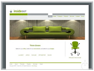
I found a website designed by Lunawebs.com for the commercial interior design firm Inside Out.
The first thing your eye is drawn to the bright green couch.  From there it saccades between the various items that match the green color of the couch.  The eye follows a scan path from the "inside out" logo at the top left, back to the couch, to the chair in the bottom right, and eventually linking to the "Think Green" just below the couch, left of center.  There is some fixation on "Think Green" which sends the eye back through the scan paths in search of green fixating on the chair and the phrase below it "product showcase" for another clue to the site.  The eye then scans back to "Think Green" and the phrase below which explains the company moto and below that a short list of the brands they carry.